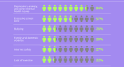
How well do you know the issues facing your students? Beyond Blue asked Australian teachers to name the top 3 health issues facing people under 18. In today’s infographic, we look at the 10 most common responses.
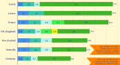
Do you feel like you’re getting enough time off each year? Recent data from the OECD’s Education at a Glace report reveals Australian primary school teachers and students have less time off each year than the majority of OECD countries measured.
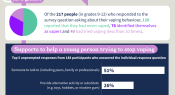
Survey data from the Office of the Advocate for Children and Young People has offered new insights into the ideas school-aged children have to offer support to a young person trying to quit vaping. Find out more in today’s infographic.
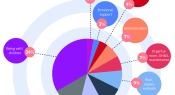
Australian research involving 321 educators who directly work with children in centre-based early childhood services involved completion of a time use diary over 10 working days. From the data, the research team created an ‘average working day’, which we share in today’s infographic.
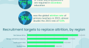
According to new research from UNESCO, 44 million additional teachers will be needed globally by 2030 to educate every child. In today’s infographic, we explore the key figures from this research, and share the recruitment targets for replacing attrition in primary and secondary schools.
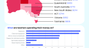
The latest 'State of our Schools' survey from the Australian Education Union - conducted in early 2023 - shows that of almost 6,000 respondents, a vast majority are spending hundreds of dollars of their own money each year on items for work.
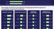
A recent study analysed TALIS (Teaching and Learning International Survey) 2018 data to examine teachers’ perceptions of occupational value in 28 OECD countries. The findings show an overwhelming majority feel undervalued in almost all countries. Here, we look at teachers’ perception of their overall occupational value, and drill down into 4 specific aspects.
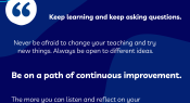
Our ninth annual reader survey recently concluded and in it, we invited you to share a piece of advice you'd give to a fellow educator. Here are some of your responses on the topic of continuous learning.
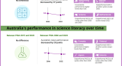
Results from PISA 2022 have been released and the data show Australian student performance in maths and reading has been holding steady since 2015, and in science since 2018. However, when looking at the past 20 years, performance has dropped significantly across the board.
What do you need information on? Technology in the classroom? Inclusivity? Making the most of your planning time? Music education? The 12th Teacher alphabet brings you quick links to popular content that you might find useful. Download the PDF for a hyperlinked version.
Facebook
Twitter
YouTube
SoundCloud
Apple Podcasts
Spotify
RSS feed
Linkedin